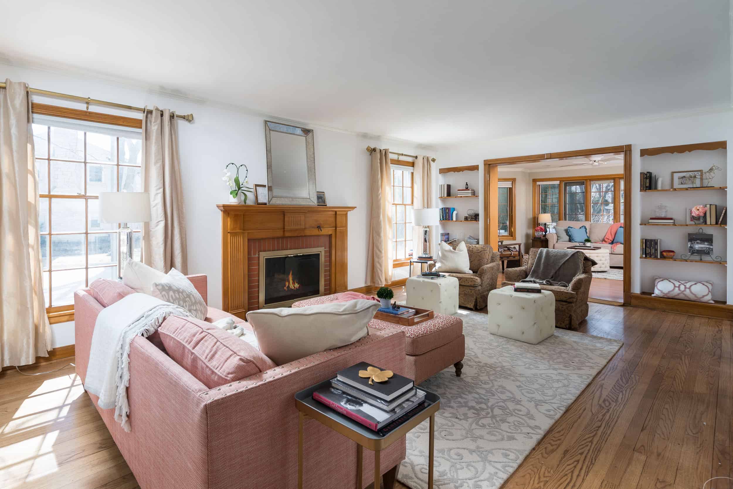
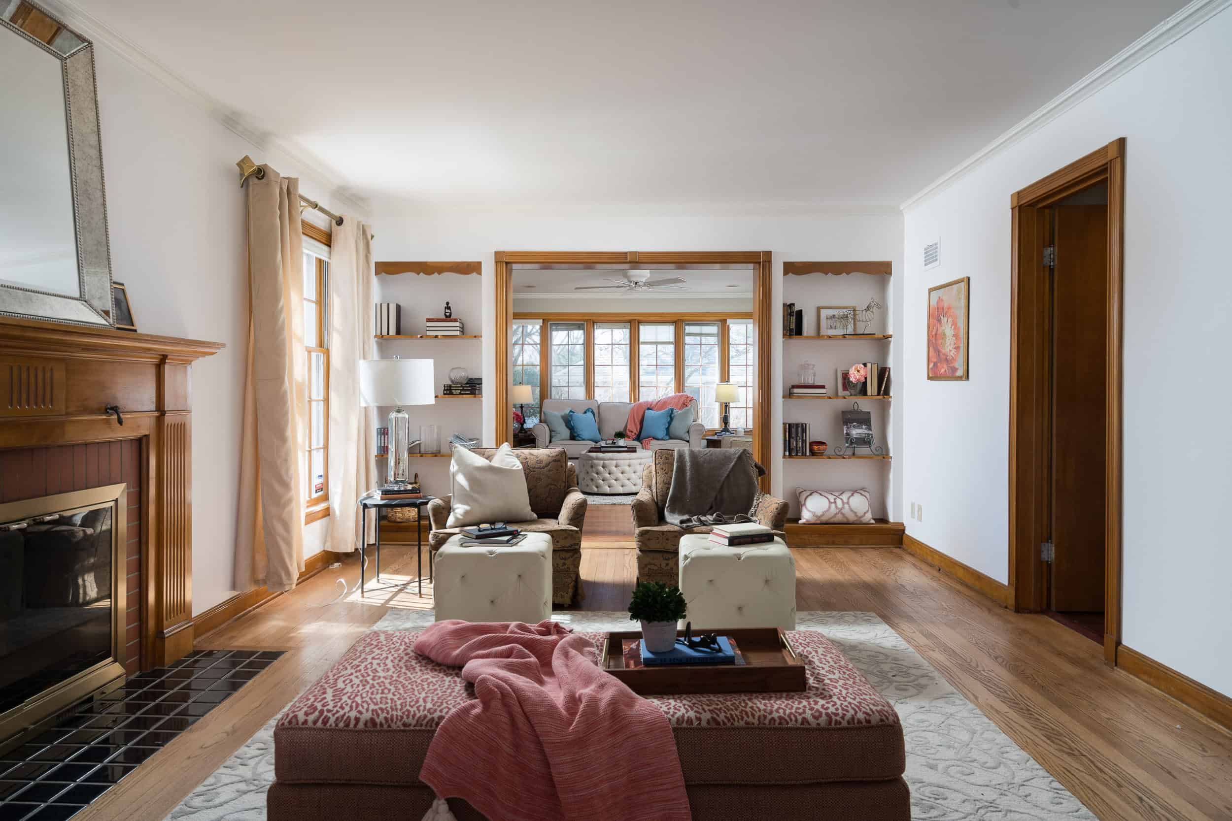
One of the easiest ways to update — and transform! — your home is via paint, and we often
work with sellers to ensure the colors they choose are marketable and increase the value of their
home. This home, for example, was re-painted top to bottom before it hit the market. The
featured colors are:
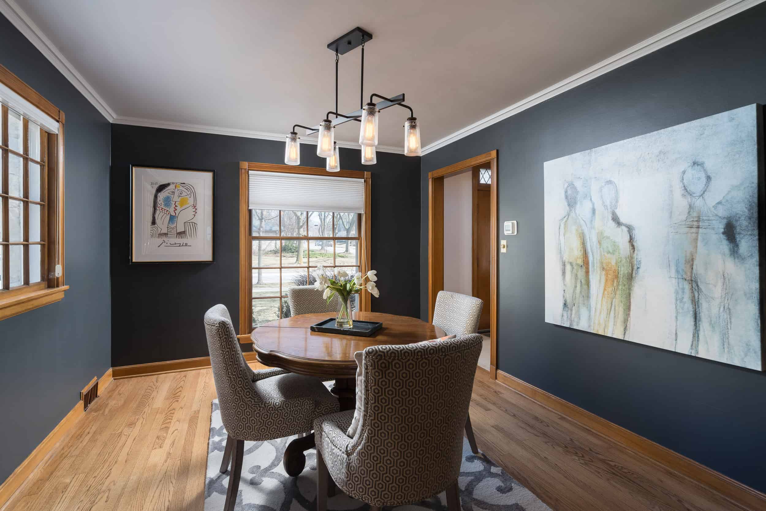
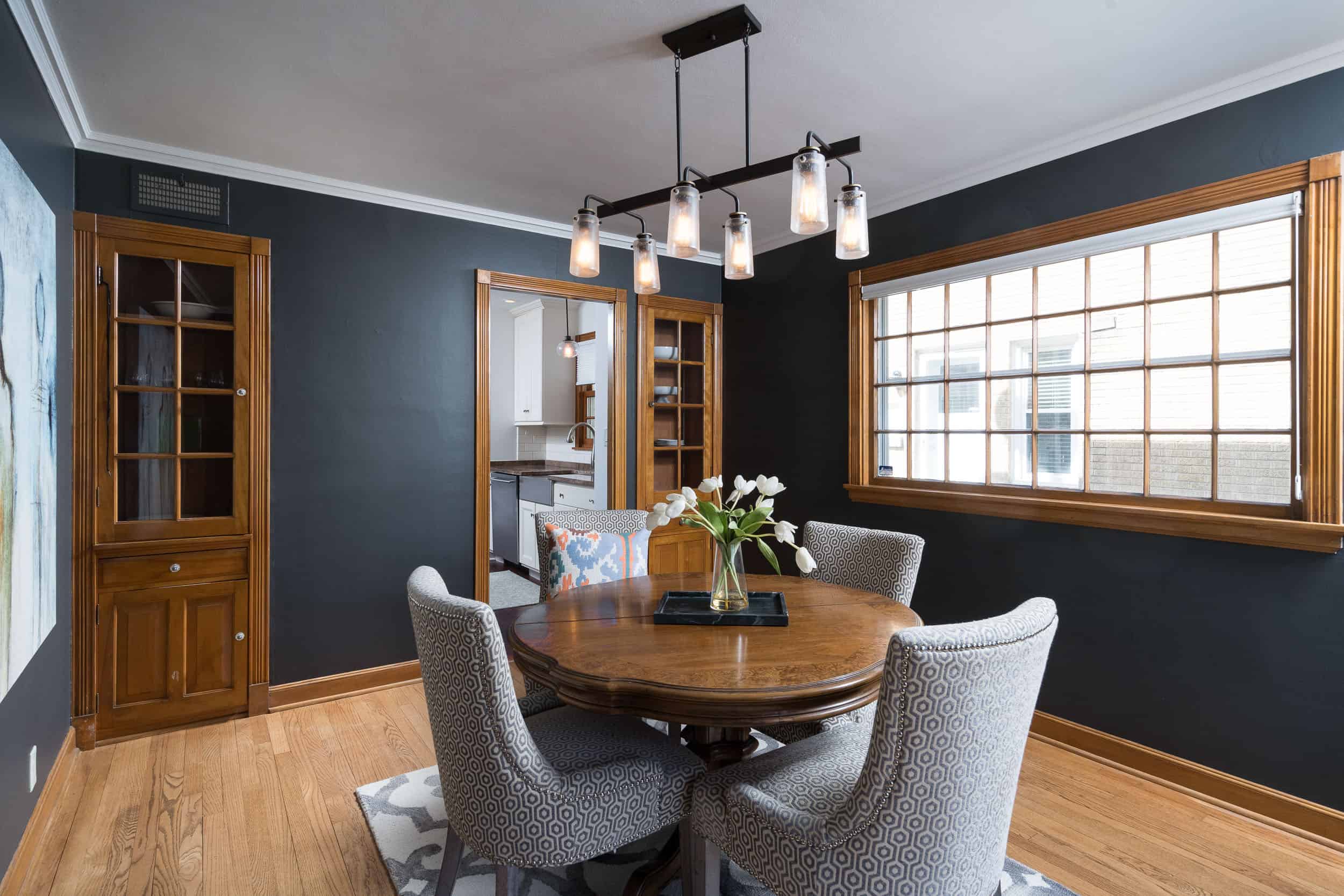
● Sherwin-Williams’ Iron Ore bathes the dining room, making a bold, dramatic statement
upon entry. (Sometimes, bold is good!)
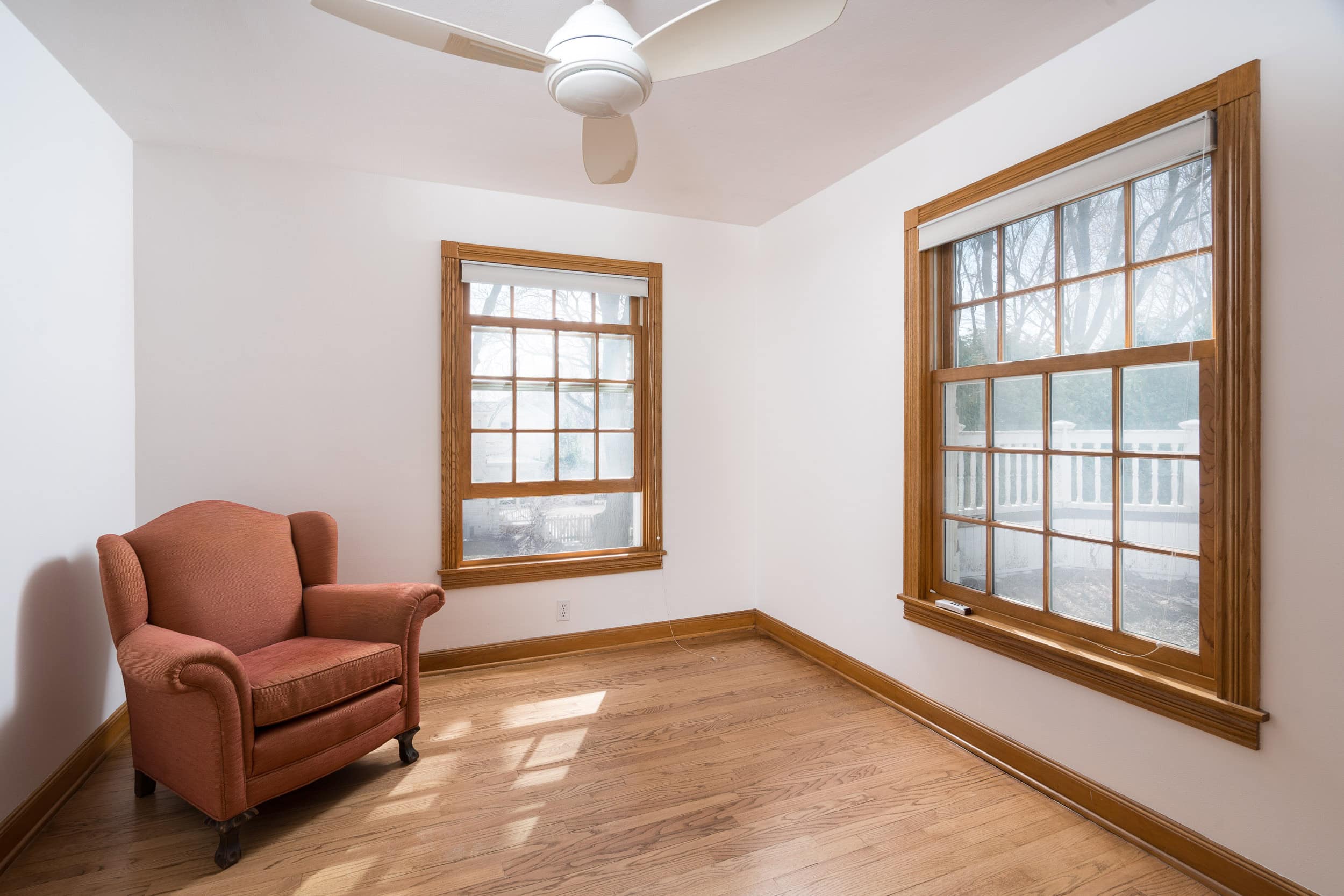
● Many of the main living areas, including the living room, hallways, kitchen, and
stairwell, are swathed in Sherwin-Williams’ Alabaster — one of our favorite creamy
whites. A great neutral foundation, if you will.
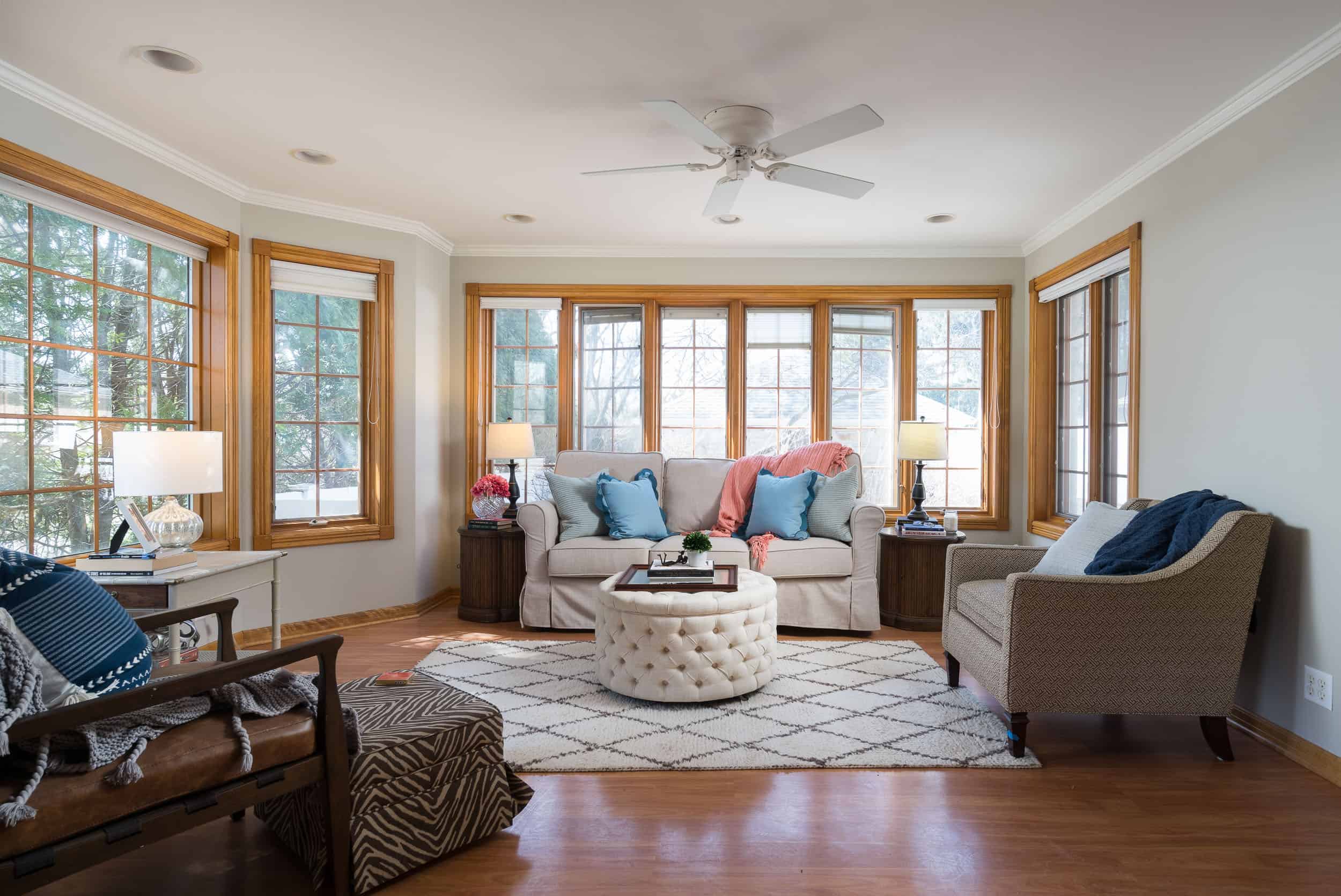
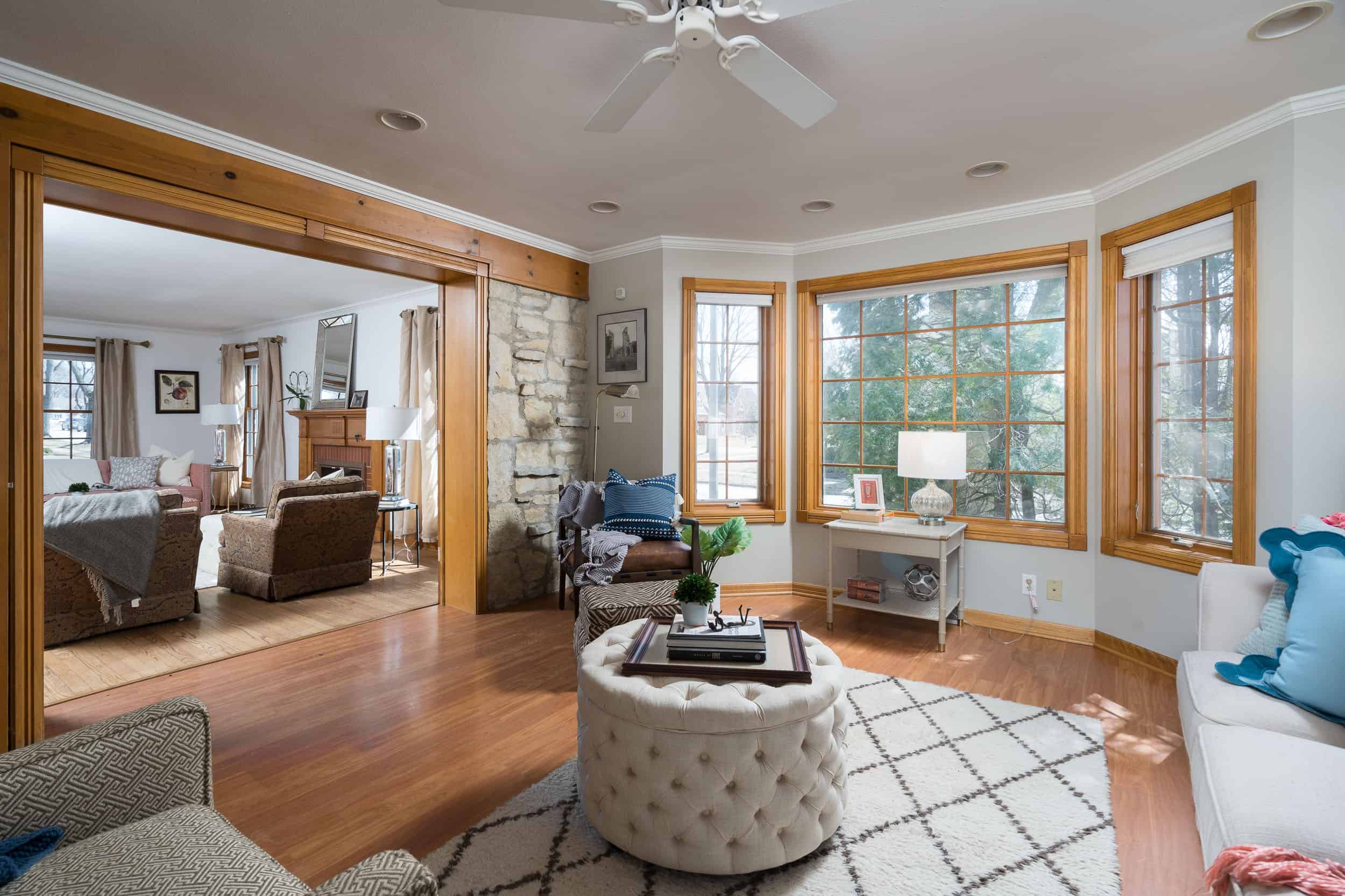
● The sunroom is painted Sherwin-Williams’ Accessible Beige, which provides a bit of
contrast and defines the space.
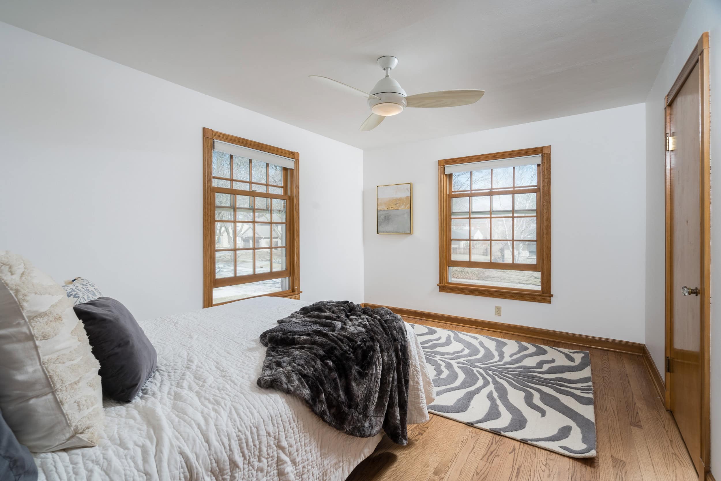
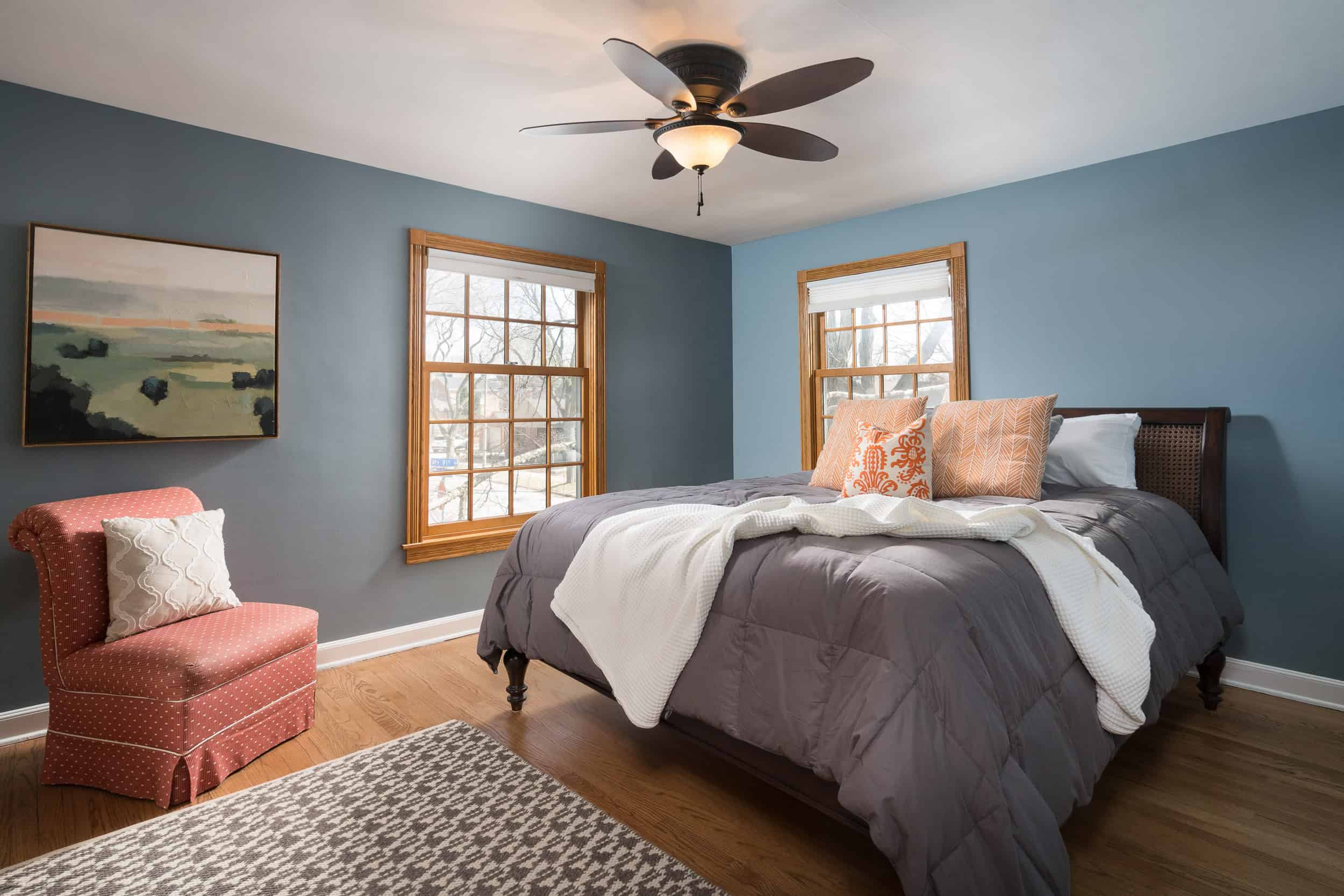
● Two of the upstairs bedrooms are also painted Sherwin-Williams’ Alabaster, but for a bit
of an unexpected — yet still arguably neutral — pop, the primary is bathed in Benjamin
Moore’s Van Courtland Blue.
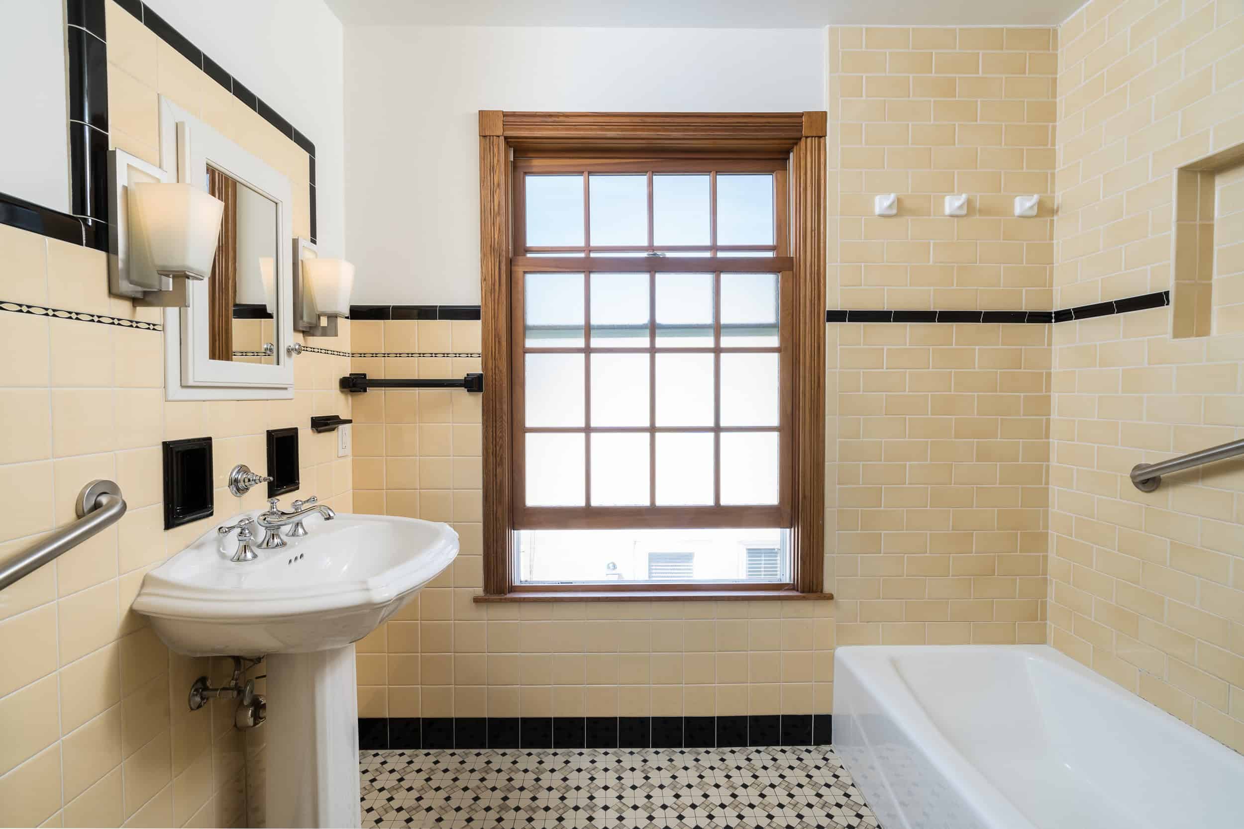
● To not detract from the original tile in the upstairs bath, we keep the wall color neutral
here, opting to paint the walls Benjamin Moore’s White Dove. (Another go-to white!)